Brands in review: Forever 21 product page images
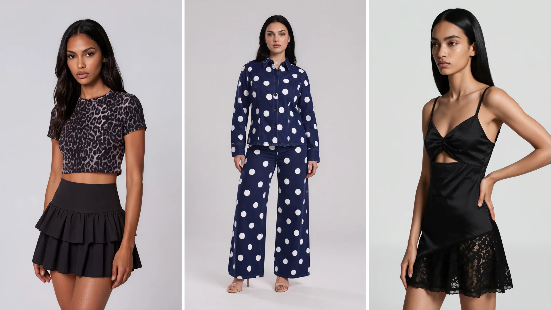
Brands in Review, episode one. A concept exploration using public product pages and Similarweb traffic estimates. Not affiliated with or endorsed by Forever 21. Opinions are our own.
A shopper lands on a cropped leopard-print tee and picks the black one, but the model on the page is wearing the brown. Nothing has broken, yet the shopper has to guess how black looks on a body.
That is where every Brands in Review episode starts: Botika takes one fashion brand and shows what its product pages do well, what is missing and how AI imagery would fix it. This is the quick read, and the full episode is in the player above.
A strong fashion product page image set is the group of photos that together answer four questions: how the garment looks on the shopper, how it looks from the back, whether the colour is real and how long it is.
Twenty-six seconds to answer four questions
By Similarweb estimates, Forever 21 draws about 1.1 million visits a month. Visitors spend just under two minutes on the site, across roughly four and a half pages, so a product page gets about 26 seconds.
In those 26 seconds the photos have to answer four questions. What does this look like on me? What does the back look like? Is that the actual colour? How long is it? If they do not, the shopper leaves.
It matters more now because a lot of traffic skips the home page: people ask an AI for a recommendation and land on a product page that may be the only one of yours they see.
The US is 69.78% of visits, followed by Canada (6.17%), Mexico (3.64%), India (1.63%) and the UK (1.54%). Roughly 30% of the traffic comes from outside the US, and all of it sees the same models.
What a page that gets it right looks like
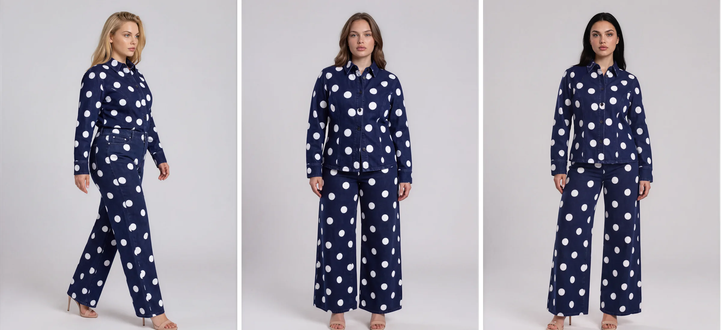
Start with a page that does it well: Forever 21's polka dot denim shirt jacket. It has eight images (six to eight is the range to look for), and every one does a job.
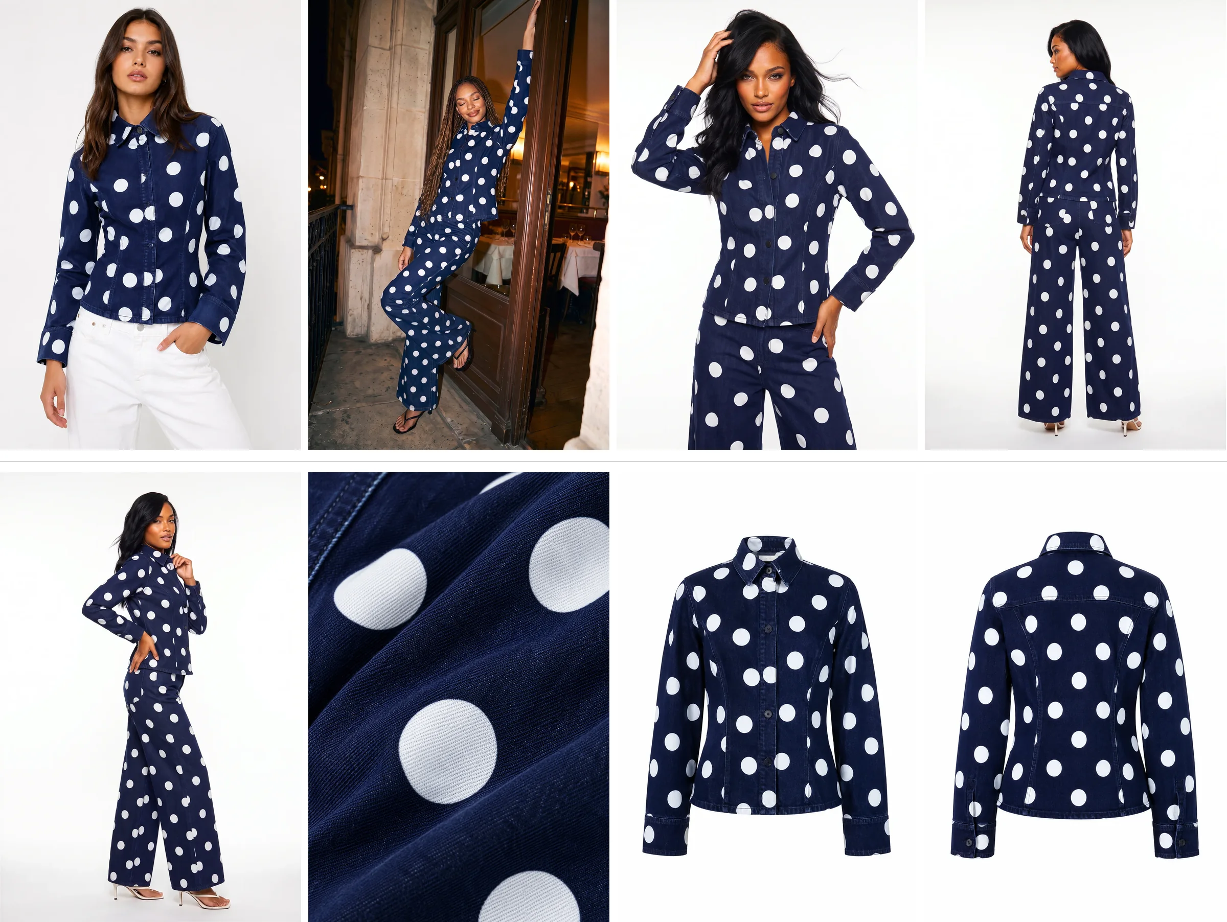
It starts with a front view on a model, because the fit is the first thing a shopper looks for. Then come the back and side views, styled, so the shape and the way it sits are not left to imagination. Then a fabric close-up, right in on the polka dot and the denim, which is the real reason someone picks this jacket over another one.
There are different women too, because people buy when they can see themselves in the photo and one model cannot do that for everybody. And there is a ghost shot, front and back. The mannequin is taken out, so the jacket holds its shape with nobody in it and the shopper can study the cut, the seams and the buttons.
On top of all that sits a lifestyle image. It makes the shopper want the jacket, and the clean shots let them buy it, which is why it goes on top and never instead.
The episode would still add two things: a short video, because movement shows how heavy the denim is in a way a photo cannot, and a plus size model, since the page shows different women but not different sizes.
Why only part of the catalog gets the shoot
Every one of those images means a crew: a model, a photographer, a stylist, hair and makeup, a studio and a retoucher. Add new styles every week, each in three or four colours, and someone has to decide which products get the full treatment.
Five product pages, four gaps and one more done well
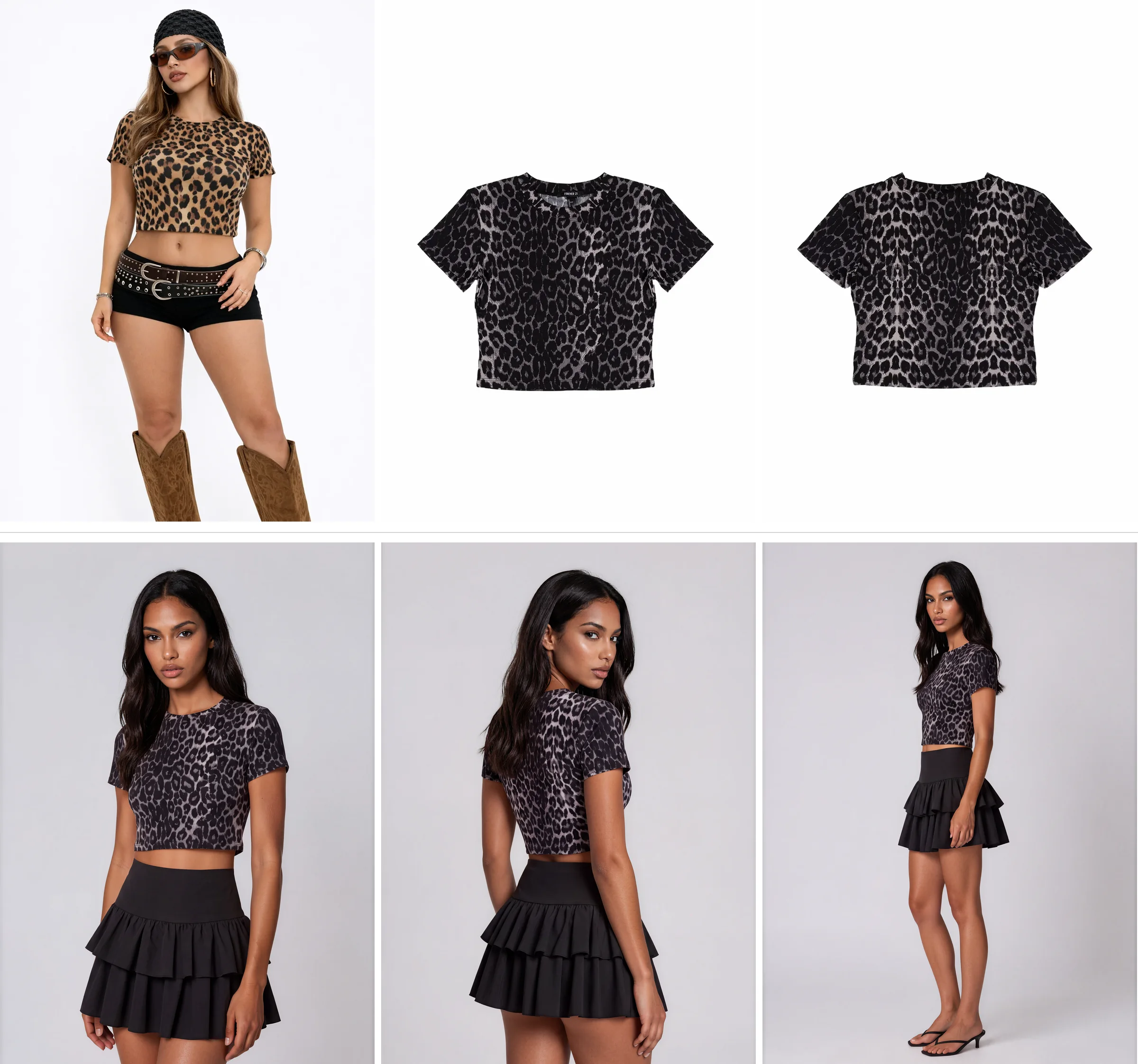
The leopard tee: the colour that never got the shoot
The tee comes in a few colours, and one of them, the brown, got the shoot on a model. The black one only has flat lays.
The shopper never sees black on a body, and with a crop top the question that matters is where it stops. A flat lay cannot say, so they guess, and guessing is how a return starts.
The fix is the same tee in black on a model, with a front, a back and a couple of angles. In Botika you pick the poses from the gallery, so the page gets variety instead of the same shot four times.
The puffer jacket: colourways with unequal treatment
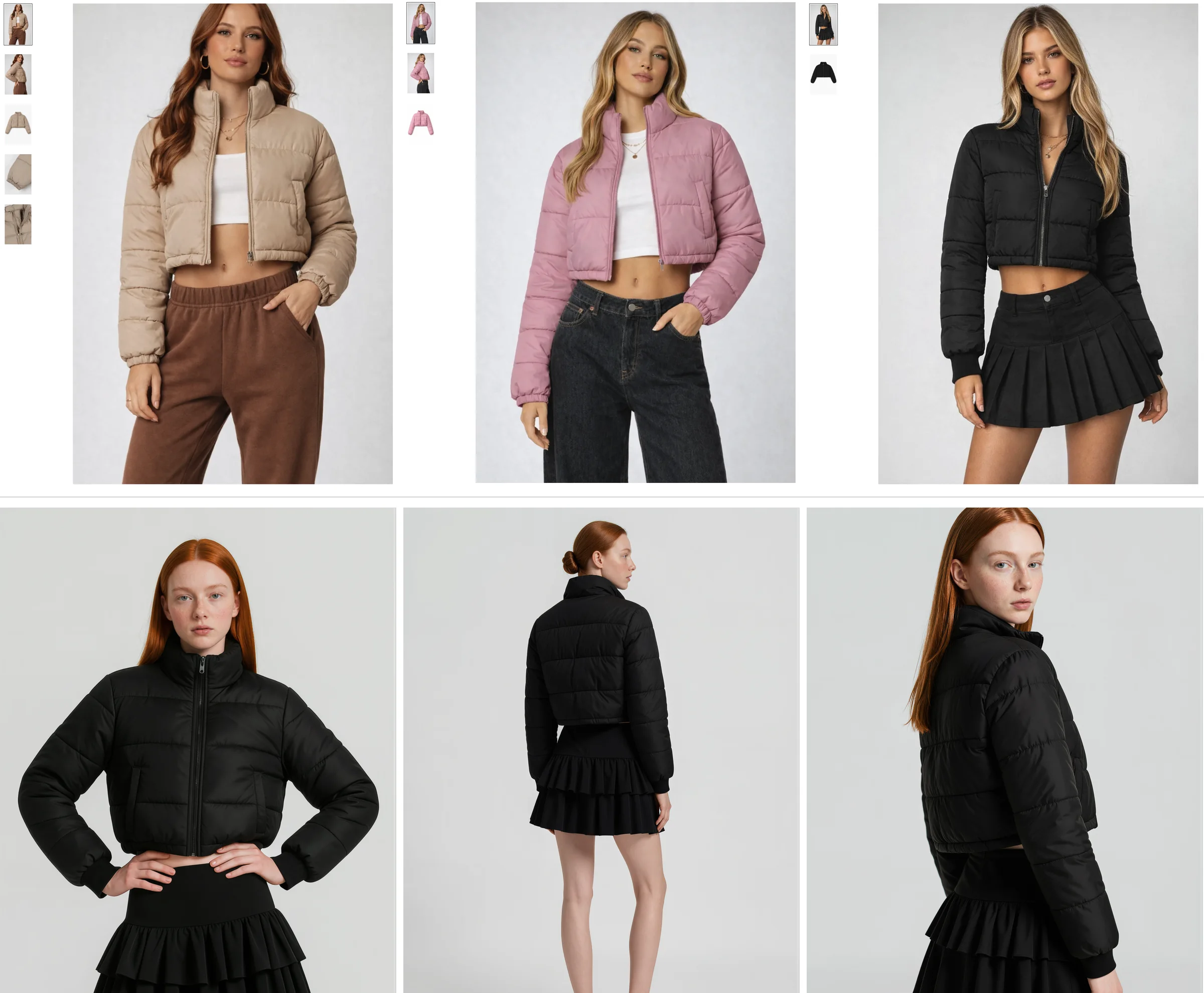
The same jacket comes in three colours, and they do not get equal treatment. The beige one is on a model, styled as a proper look. Click into the other colours and the gallery shrinks: five images for the beige, three for the pink, two for the black.
Nobody clicks through to another colour just to imagine the one they want. They leave. The fix is simple: every colour gets the same set of images.
The headless dress: the licensing story
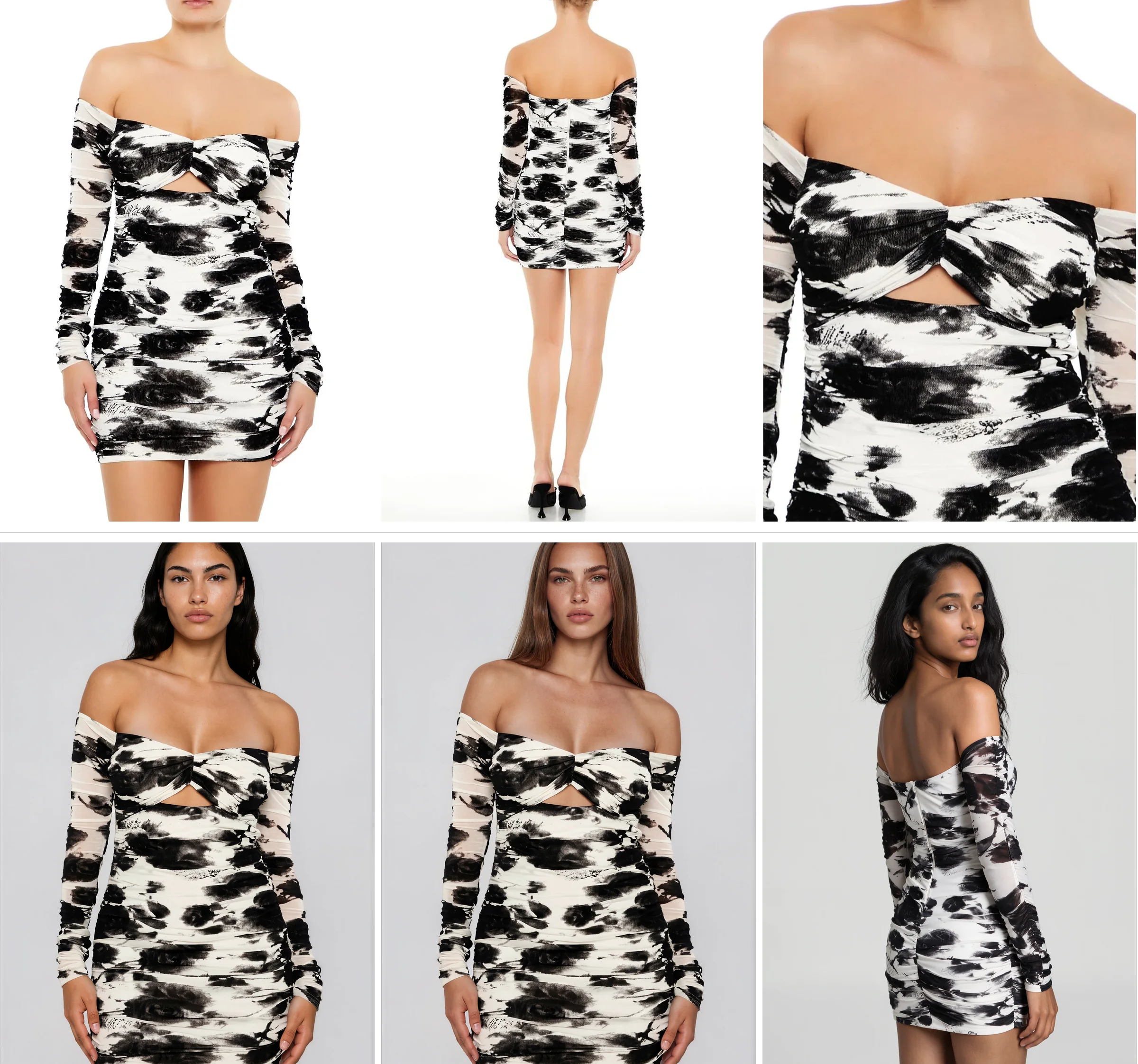
Then there is the page cropped right at the neck. It is usually a licensing choice, not a creative one: a brand pays a model for a set period of use, and when it runs out it either pays again or crops the head out. A lot of brands simply crop.
That is a shame, because the face is what lets a shopper picture themselves in the garment. Without it, the page can look like stock imagery.
With AI models there is no clock running on the image and no per-model fee, so the same dress can go on completely different women. That matters when roughly 30% of visits come from outside the US.
The cami: another page done well
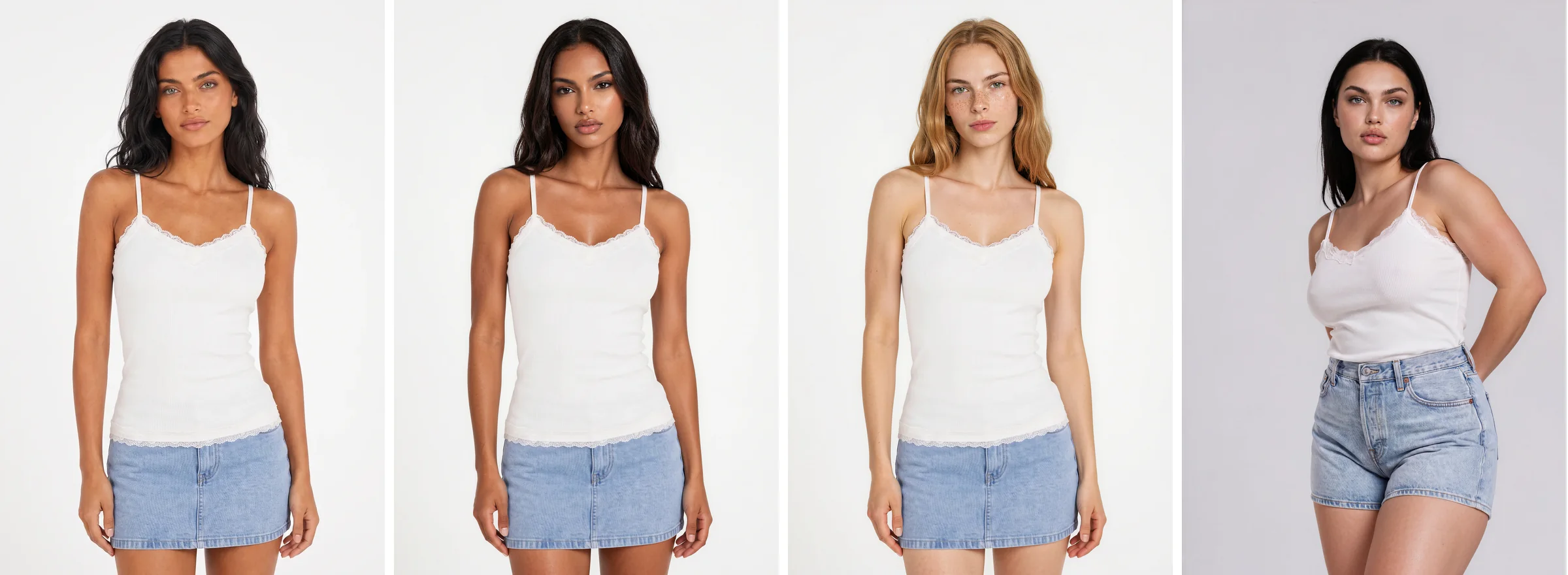
The cami gets it right too: different angles and clean shots, so the shopper sees exactly what they are buying, plus an editorial image on top that gives it a place and a mood.
The episode would add different models and a plus size model. If someone cannot see the product on a body like theirs, they are never sure it will work.
The lace dress: the product a flat lay cannot explain
The last page is a hard product to sell: light fabric, lace detail, open at the front and short. The only photo of it being worn is a beautiful image on a beach.
How long is the dress? Where does the cutout sit? What does the lace do when the wearer moves? The rest of the gallery is two flat lays, and every unanswered question is a return waiting to happen.
Keep the beach shot and add the basics underneath: a front, a back, a side and one walking. For this dress, add video too, because you cannot understand light fabric and lace standing still.

Count the images on your top ten products
Forever 21 does a really good job, and the episode notes the brand is already using AI imagery, which it calls exactly the right call. Large or small, the constraint is the same: a few shooting days and a collection that does not stretch to cover them.
So open your top ten products and count the images. The first few things to look for come from the episode's wrap-up, and the rest from the pages above.
Start with the count. A product with fewer than six images is under the six to eight range, and each image should have a job. Then look for the back view, because shoppers want to see it and, if your page does not show it, they will find one that does.
Check every colour too: each colourway needs its own full set, and photos borrowed from another colour count as missing.
Then look at the faces and the bodies. A head cropped at the neck takes away what lets a shopper picture themselves in the garment, so start with your best sellers. Ask whether it is always one model with one body size, or whether there is more than one woman and more than one size. Our guide to diversity in fashion covers why that matters.
Last, look at the products a still cannot explain. Light fabric, lace and heavy denim need movement, and a short video or a walking shot answers what a photo cannot. And make sure the lifestyle image sits on top of the clean shots and never replaces them. Our guide to fashion product detail pages covers the rest of the page.
Fixing the gaps without booking a shoot
Botika works from photos you already have, including ghost mannequin shots and flat lays. You pick the model and poses from the model gallery, so a missing colourway, back view or extra model is another photo, not another shoot. The short product videos hard products need come from the same photos.
Botika is the AI operating system for fashion content. Brands on Botika cut production costs by 90%, move from sample to live 10x faster, and lift conversion by 40%.
Watch the full episode
The episode walks through all six pages. Watch it on YouTube, and tell us in the comments which brand Brands in Review should look at next. Before you book another shoot, see what your own pages could look like with a free trial.